Overview
Skustack’s Insights feature provides valuable insights into your warehouse operations. Through data aggregation charts and detailed activity monitoring, you can seamlessly track various key metrics and workload statistics that help you identify bottlenecks and enhance overall workflow efficiency.
Monitor Activity
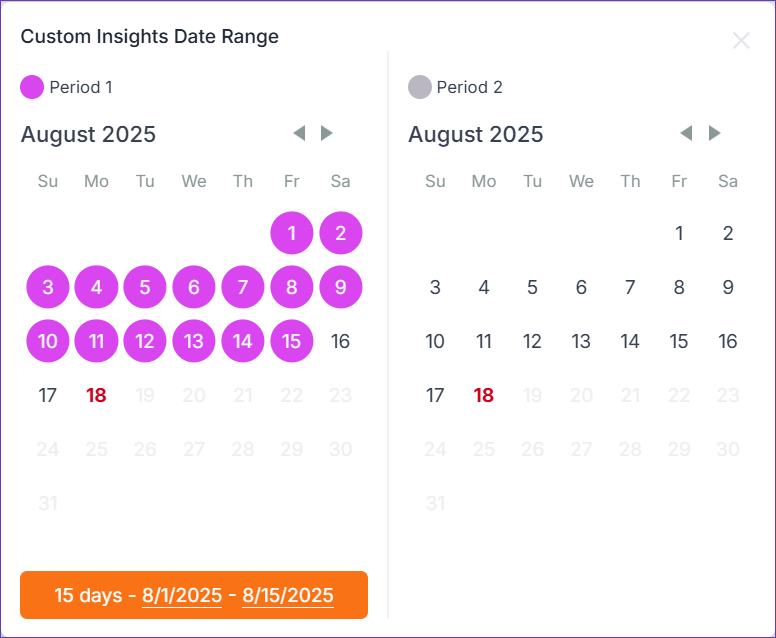
Gain a comprehensive understanding of your operations by visualizing the overlap of various activities over a specific period. Compare the processes of any two timelines by using the Custom Range functionality and track detailed stats on a minutely or hourly basis to obtain valuable insights into your workforce productivity.
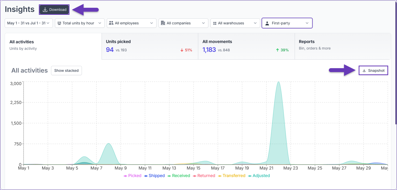
All Activities
To see a summary of all activities:
- Navigate to the Skustack Lens portal at https://lens.skustack.com.
- Enter your team name and login credentials.
- Select Insights > All activities.
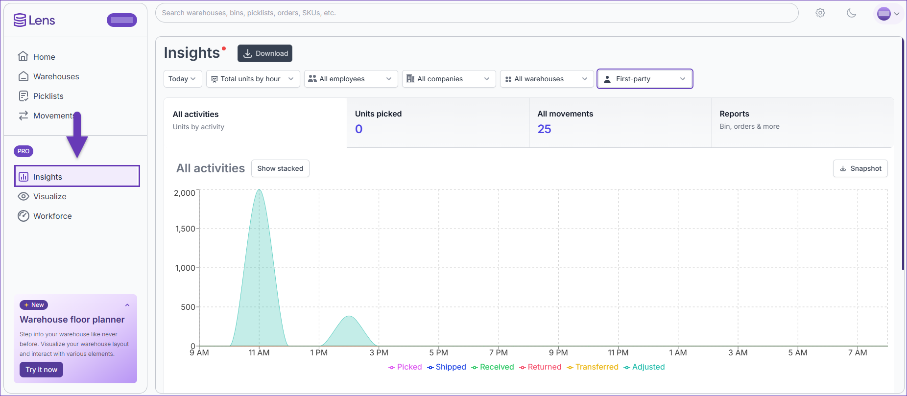
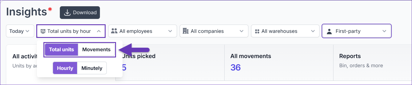
- All Skustack activities are dynamically loaded and updated in real time. Choose the type of displayed data analysis: either Total Units or Movements, and specify your time preference as Minutely or Hourly.
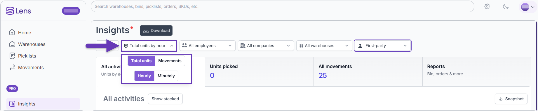 The minutely preview is only available when using a date filter specifically set to “Today” or “Yesterday”.
 - Select the time frame of the activities that you want to display.
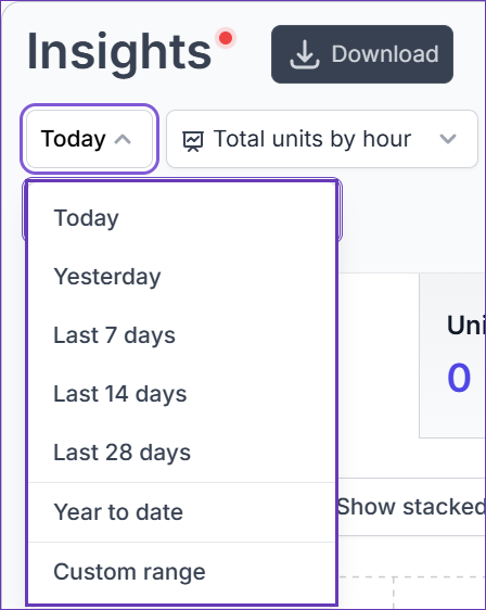
- You can also compare the processes of two different time frames by choosing the Custom range option and adding the respective durations. The periods must be equally long and cannot be identical.
- (Optional) Filter by your desired warehouse and/or employee/s.
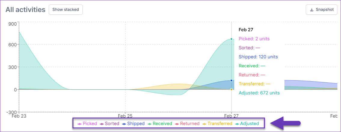
- The All activities tab has two distinct graph modes – Individual and Stacked. To enhance visualization, each activity type is represented with a unique color in both modes.
- Hover over the graph for a detailed breakdown of each activity type at a specific time. This graph also illustrates negative movements, extending below the midpoint line (X-axis).
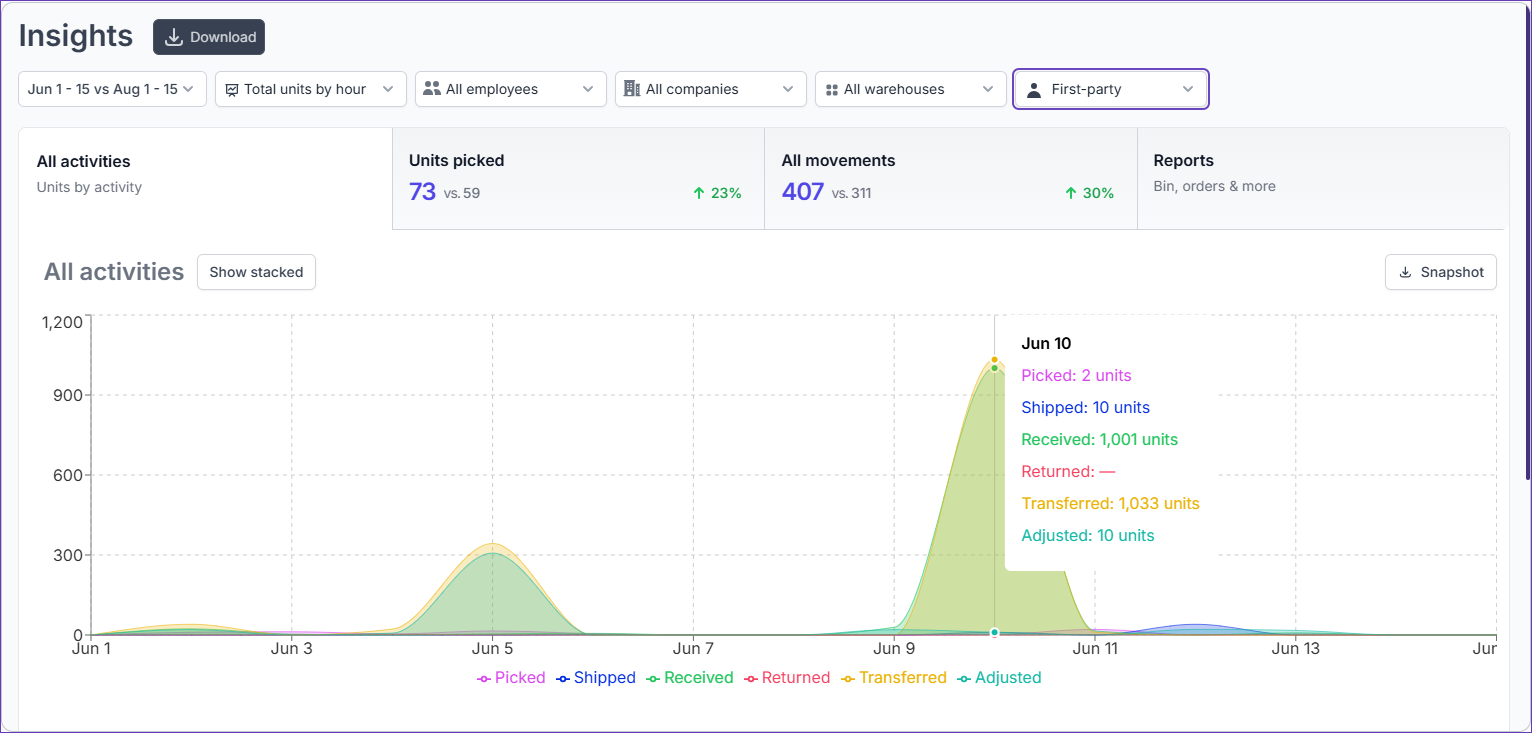
- Click on an activity type to include or exclude it from the graph. All types are included by default.
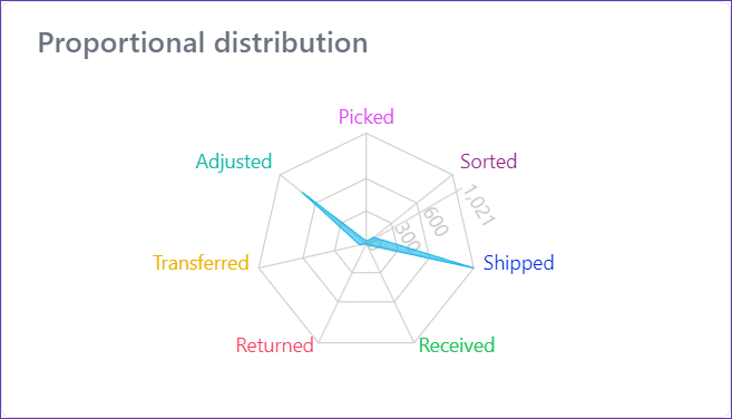
- The allocation of resources based on their daily volume and selected preferences (step 7) is displayed in the Proportional distribution chart. This graph starts at 0 and therefore depicts only positive quantities.
- If necessary, you can export the data as a graph via the Snapshot button, or as an Excel file via the Download one.
Picking Tab
The information displayed in the Picking tab varies based on your data analysis preference:
- If you intend to explore the information in units, select Total units analysis mode.
- To view the data as individual movements, choose the Movements mode.
Units Picked
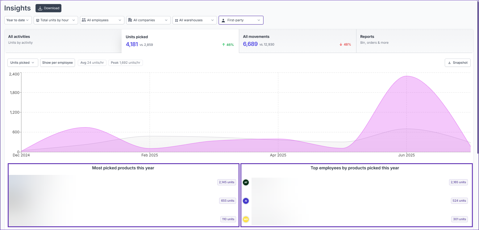
The Units Picked tab becomes available once you choose Total units view mode and provides insights into the units of each activity type separately. The units picked are displayed by default, however, the filters can be adjusted based on your preference and the tab name will be updated accordingly.
- Navigate to Insights > Units Picked.
- Filter by your desired Activity type:
- Units Picked
- Units Sorted
- Units Shipped
- Units Received
- Units Returned
- Units Transferred
- Units Adjusted
For a detailed breakdown of each movement and the activity type it belongs to, refer to this article. - Choose a time preference for the displayed data – either Minutely or Hourly.
The minutely preview is only available when using a date filter specifically set to “Today” or “Yesterday”.
- Select the time frame of the picking activities that you want to display.
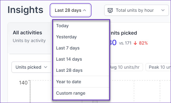
- You can also compare the processes of two different time frames by choosing the Custom range option and adding the respective durations. The periods must be equally long and cannot be identical.
- (Optional) Filter by your desired warehouse and/or employee/s.
- This tab has two distinct graph modes – Overall and Per Employee. The Per Employee mode allows you to view the movements either individually or stacked. To enhance visualization, each employee is represented with a unique color in this mode. An average and peak aggregation analysis is also available.
- Hover over the graph for a detailed breakdown of the processed units per Activity at a specific time.
- If necessary, you can export the data as a graph via the Snapshot button, or as an Excel file via the Download one.
- Additional insights are available below the graph, offering detailed rankings for both products and employees:
- Product Ranking – This section presents a comprehensive list of the top processed products for the selected Activity and time period. The analysis offers an overview of the SKUs and the corresponding quantities processed, allowing for a clear understanding of product performance.
- Employee Ranking – This section showcases a ranking of the top-performing employees for the chosen Activity and time frame. It highlights individual contributions, providing valuable insights into employee performance and productivity within the specified period.
Picking Movements
The Picking movements tab becomes available once you choose the Movements view mode. Here you can find the movements insights of each activity type. The picking movements are displayed by default, however, the filters can be adjusted based on your preference and the tab name will be updated accordingly.
- Navigate to Insights > Picking movements.
- Filter by your desired activity type:
- Picking movements
- Sorting movements
- Shipping movements
- Receiving movements
- Return movements
- Transfer movements
- Adjustment movements
For a detailed breakdown of each movement and the activity type it belongs to, refer to this article. - Choose a time preference for the displayed data – either Minutely or Hourly.
The minutely preview is only available when using a date filter specifically set to “Today” or “Yesterday”.
- Select the time frame of the activities that you want to display.
- You can also compare the processes of two different time frames by choosing the Custom range option and adding the respective durations. The periods must be equally long and cannot be identical.
- (Optional) Filter by your desired warehouse and/or employee/s.
- This tab has two distinct graph modes – Overall and Per Employee. The Per Employee mode allows you to view the movements either individually or stacked. To enhance visualization, each employee is represented with a unique color in this mode. An average and peak aggregation analysis is also available.
- Hover over the graph for a detailed breakdown of the movements at a specific time.
- If necessary, you can export the data as a graph via the Snapshot button, or as an Excel file via the Download one.
- Additional insights are available below the graph, offering detailed rankings for both products and employees:
- Product Ranking – This section presents a comprehensive list of the top processed products for the selected Activity and time period. The analysis offers an overview of the SKUs and the corresponding processed movements, allowing for a clear understanding of product performance.
- Employee Ranking – This section showcases a ranking of the top-performing employees for the chosen Activity and time frame. It highlights individual contributions, providing valuable insights into employee performance and productivity within the specified period.
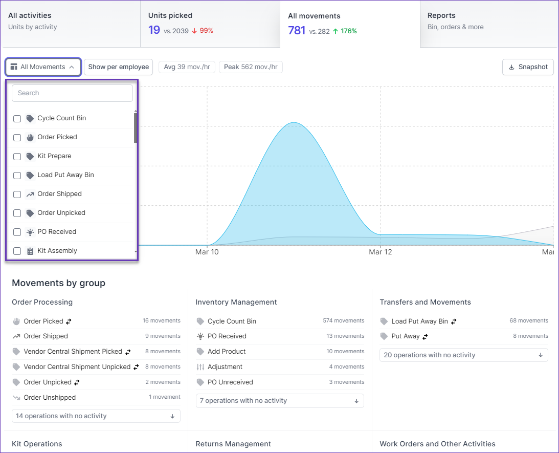
All Movements
The All Movements tab allows you to have complete visibility into all movements happening within the warehouse. This includes movements such as receiving goods, transferring inventory between bins, picking orders, shipping products, and more:
- Navigate to Insights > All Movements.
- All Skustack movements are dynamically loaded and updated in real time. Choose the preferred data analysis type – minutely or hourly.
The minutely preview is only available when using a date filter specifically set to “Today” or “Yesterday”.
- Select the time frame of the movements that you want to display.
- You can also compare the processes of two different time frames by choosing the Custom range option and adding the respective durations. The periods must be equally long and cannot be identical.
- (Optional) Filter by your desired movement type, warehouse and/or employee/s.
- This tab has two distinct graph modes – Overall and Per Employee. The Per Employee mode allows you to view the movements either individually or stacked. To enhance visualization, each employee is represented with a unique color in this mode. An average and peak aggregation analysis is also available.
- If necessary, you can export the data as a graph via the Snapshot button, or as an Excel file via the Download one.
- The movement volume for the selected date range is visually highlighted in a unique blue color on the graph, while the projected volume based on the same duration from the previous period is represented by a distinct gray shade.
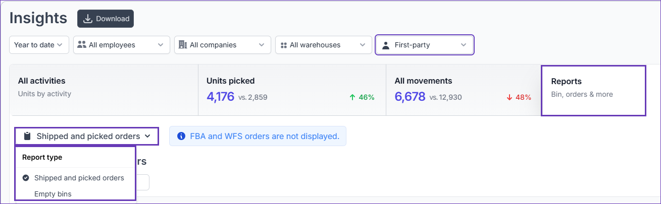
Reports
The Reports tab provides you with access to detailed reports on empty bins, shipped, and picked orders. By tracking empty bins, you can identify areas where stock levels are depleted and take proactive measures to replenish inventory, while tracking shipped and picked orders enables you to identify any potential delays in those operations and improve overall efficiency. To do that:
- Navigate to Insights > Reports.
- Choose your desired mode – Empty Bins or Shipped and Picked Orders.
Empty Bins
- Select Empty Bins in the Report type dropdown. The grid will load and the following information will be displayed:
- Name
- Region
- Total units available
- Total physical units
- (Optional) Filter by your desired warehouse.
- Select the type of bins you want to generate a report for – Sellable or Unsellable.
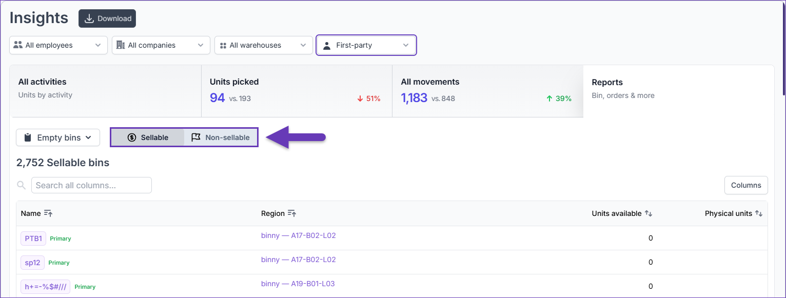
- Use the up and down arrow icons next to each column in the grid to adjust your sorting options based on your preference.
- Click on a bin to see all products and movements that happened within that bin.
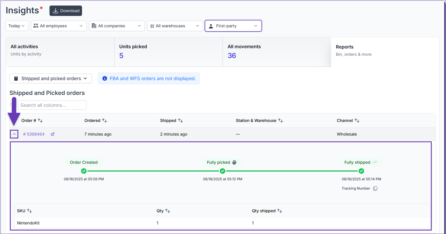
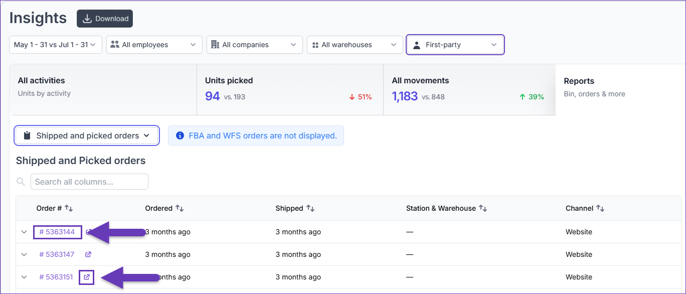
Shipped and Picked Orders
- Select Shipped and Picked Orders in the Report type dropdown. The grid will load and the following information will be displayed:
- Order #
- Ordered
- Shipped
- Station & Warehouse
- Channel
- (Optional) Filter by your desired date range, warehouse location and/or employee.
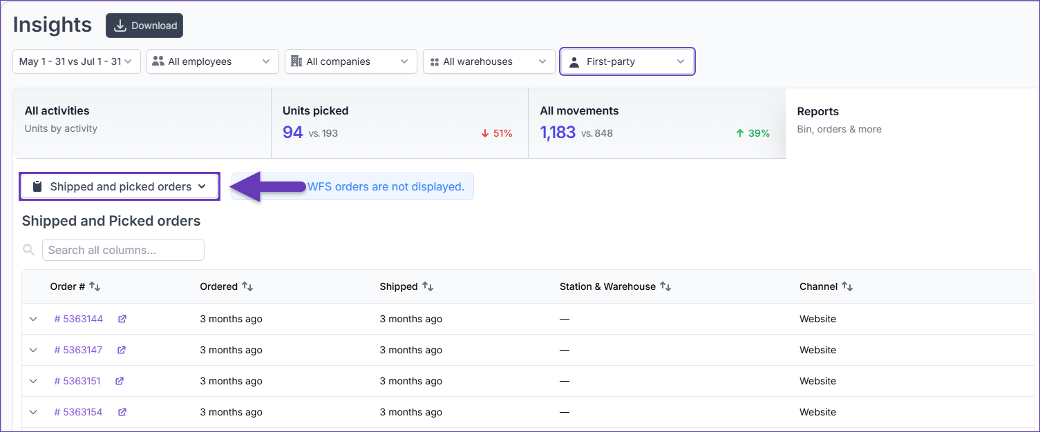
- Use the up and down arrow icons next to each column in the grid to adjust your sorting options based on your preference.
- Click on an Order # to open its associated Movements. The icon next to the Order # will direct you to the Order Details page.
- Click the arrow next to the Order # to reveal a timeline with key events and information about the ordered and shipped products.